Thursday, 8 January 2015

Printmaker Rembrandt - 'The Three Crosses'


This image is a dry point etching called ‘The Station of the Cross (The Three Crosses). This print is by the Dutch printmaker Rembrandt (1606-1669) in 1653.  This print is considered one of Rembrandt’s finest works, and this print represents the highlight of his career in printmaking.
http://upload.wikimedia.org/wikipedia/commons/6/64/Rembrandt_Harmensz._van_Rijn_-_Christ_Crucified_Between_the_Two_Thieves_(%22The_Three_Crosses%22)_-_Google_Art_Project.jpgThis image is of the fourth state of the etching. Rembrandt completely transformed the plate by scraping away large areas of the print, completely changing the composition of the original form. However, some of the first print is still visible underneath the hatching. He covered the sky with strong parallel lines portraying beams of light highlight the remaining figures on both sides. Also, the Christ's face has been altered to show his mouth open and his eyes half-closed. Together, these small changes alter the subject matter of the print. This change now focuses your attention to the figure of Christ in the final moments before his death.


http://www.metmuseum.org/toah/images/h2/h2_41.1.33.jpg
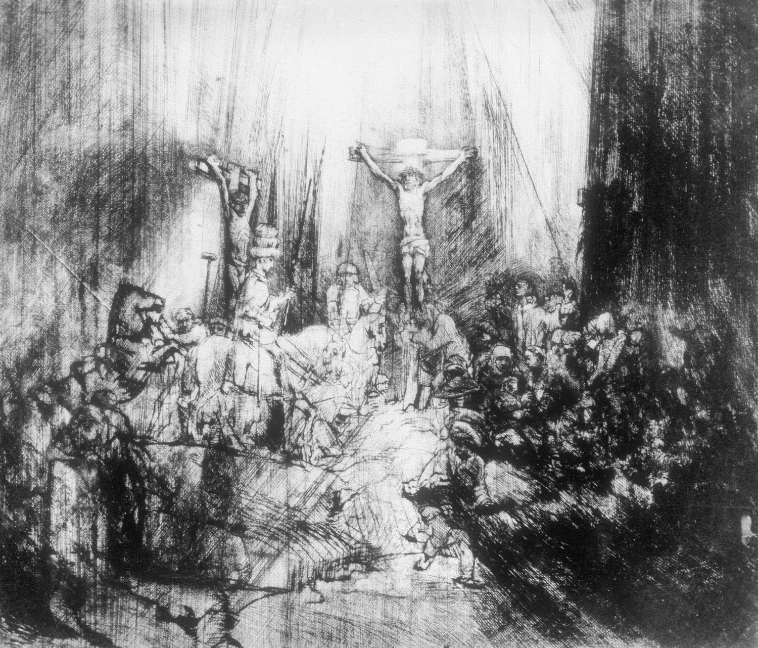
In earlier stages of the print, we see the scene is total chaos. The cross is surrounded by busy crowds, some of which are grieving family and friends. Here, Rembrandt altered the composition by darkening and obscuring the crowd so that the central focus is Christ on the cross. Rembrandt cast a dark light over the scene by working over the entire plate with hatched lines, which creates an eerie atmosphere.
Rembrandt was a great innovator and experimenter in this medium, often handling traditional materials in unconventional ways, and I feel he still has a lasting impact on the printmaking world today.

Friday, 7 November 2014

Printmaker Eduardo Paolozzi

 
Eduardo Paolozzi (1924 - 2005) was a British sculptor, collagist, printmaker, filmmaker and writer. He was briefly inspired by the movement Surrealism where he produced collages and immerged them with his interest of modern machinery, and his collages then remained a main part of his printmaking work.


Paolozzi began to focus on printmaking and in the 1965 created a well-known artwork in the Pop Art establishment; 'As Is When' which was a portfolio of 12 screen-prints which were loosely inspired by the life and work of the philosopher Ludwig Wittgenstein. He based this work on complex collages, and his prints included elements of texts, abstract patterns, pictures of aeroplanes and other machines, together with Disney characters.

I have enjoyed looking at the prints by Eduardo Paolozzi because I like the way he has used bright and contrasting colours and a mixed of geometric shapes, which illustrates he is not afraid to experiment with colour and composition. Also, I feel each print has a complex design which successfully carries your eye round the whole of the print. Finally I love the introduction of modern machinery into his work because it creates interesting shapes, as well as giving it a futuristic feel.


Thursday, 6 November 2014

Print by Picasso, Vollard Suite

Unfortunately I have never came across these prints by Picasso from the Vollard Suite before, but I'm glad I now have because I find them simply amazing. I love how he has managed to capture a moment each print you look at, which is somehow able to tell a story in one static print. In addition to this, Picasso has also continued the idea of romantic connotations in each of his prints.

What also interests me about his prints is the way he can make such a minimal amount of markings on the etching plate, but is still able to create the perfect interpretation of the human body, which is only one example.

I found each print I would look at even better than the last, but I picked a print which I feel best represents what I am saying about his simplistic approach to etching. We can see from the picture I have chosen that Picasso's markings create movement in the males body by defining the muscles, which also creates a small contrast with the female who's body is only created by adding a few marks, but is no less effective. Similarly, the composition works effectively by drawing your eye into the centre of the print which is of a males face, this works well by having the body language of the two figures leaning in towards it.

I have enjoyed looking at the etchings by Picasso, and it has enlightened me that in printing, sometimes less is more. I will definitely be using this work as inspiration for the next time I will be printing.


Wednesday, 5 November 2014

Katie Ward


After a trip to the Scottish National Gallery in Edinburgh, I discovered many new artists whose work I found very inspiring. However, I picked Katie Ward because I found it interesting how she uses mixed media in her artwork, because I am currently experimenting with it in one of my art units.


The reason Ward's work stands out for me is for a number of reasons. I love the large scale she works at, and the bold expressive brush strokes she uses. The range of brush strokes creates texture but also creates a movement to the piece. I also find it inspiring the way she is able to use bold objects such as wood and string and still manages to make the painting look as if its totally normal and blends in when looked at from a distance.


Finally in all of her work I have noticed a repetition of circular movement and shape, with the use of a limited palette. There are similarities in each of the paintings, but I like how each of them can differ and she brings something new eg. with the scale or angle. I think she has also achieved this by using a range of textures by incorporating the mixed media.


These are some of the images I took while at the gallery; the painting at the bottom is called 'Haining Diptych 1' which is oil, acrylic and bitumen on board with birch barch and jute string. I took this photograph from a side angle so that you were able to appreciate the mixed media she has managed to include in this piece.

Monday, 3 November 2014

Printmaker - Alasdair Gray

Alasdair Gray Bill Skinner in His Otago Street Home
Alasdair Gray is a Scottish printmaker who was born in Glasgow in 1934. Gray is also known for being a novelist, a muralist, playwright, printmaker and illustrator; his best- known pieces of work as a visual artist are his graphic illustrations for his own books.
I have chosen two prints of his collection which I found most intriguing to look at. The print on the left is called 'The Death Will Break', which is 76 x 56cm.  The reason I picked this piece was to do with the bold colours used. I love how the bright flat use of colour on the background makes the black stand out, but I also feel it makes the piece  very modern. The highlights of blue used around the bottom I feel draws your eye  from the top of the print to the bottom, which is to the poem.
The second print I have chosen is called 'Bill Skinner in His Otago Street Home' which is on the right. This is a screenprint, which was done in 2011, and is 56.3 x 29 in size. I found this print interesting because of the emotion Gray has managed to portray on this mans face. The body language of his crossed arms and the intense stare illustrates that he is deep in thought, which makes you wondering what is on his mind. This contrasts well with small view of the busy city life we see from out of his window, which he pays no attention to. The use of the black wall in the background helps the man to stand out, but it also emphasises your attention again  back to the busy life outside of his flat. Similarly to the other print, his use of a limited palette works well in making the print easy on the eye.
Personally I like the work of Alasdair Gray, but I don't find them overly influential or inspiring. His figures of people feel cartoon and almost puppet-like, which I consider them to be sometimes quite disturbing to look at. However, he is a very talented printmaker, and I enjoyed looking at his work.


Monday, 27 October 2014

Futurism

Futurism was an art movement launched by the Italian poet Filippo Tommaso Marinetti in 1909. Futurism started when a small group of radical Italian artists began working just before the outbreak of the First World War.
Among modernist movements, the Futurists focused towards a new and modern Italy. This was partly because the weight of past culture in Italy was felt uninspiring. The three artists which were known for their Futurism Movement were Giacomo Balla, Umberto Boccioni and Gino Severini. They were influenced by using speed, machinery and war as subject matter.


http://bittleston.com/artists/giacomo_balla/images/Giacomo_Balla-Warship__Widow_and_Wind-Painting-1916.jpg
Giacomo Balla was born 1871 and died in Rome 1958.  He was an Italian Futurist painter, sculptor and designer. He was a largely self-taught artist and his early works were portraits, landscapes and caricatures, and then he became increasingly interested in painting aspects of modern industrialised life. He went on to teach both Severini and Boccioni, which is why I also chose to talk about their work. Balla rapidly became one of the most original and inventive painters of the Futurist movement.
 
http://o.quizlet.com/W7vYYiUNp8sERQY1D6-Zgw_m.jpgSecondly, Umberto Boccioni was born in 1882 and died 1916. He was an Italian Futurist painter, sculptor and etcher. By 1907, Boccioni wished to paint a modern industrial society, and was well known for his Futurist paintings around 1910, as well as adopting some Cubist techniques in his paintings. He also began to make sculptures, and by 1912 he issued a Technical Manifesto of Futurist Sculpture, and by 1914 his paintings had become distinctly Cubist and relatively static.
 
http://annex.guggenheim.org/collections/media/490/44.944_ph_web.jpgFinally, Gino Severini (1883-1966) was an Italian painter, designer and writer in art. In 1900 he met Boccioni and decided to become a painter; introduced by Boccioni to Balla, who initiated him in the Divisionism style. Along with Balla and Boccioni, Severini signed the Technical Manifesto of Futurist Painting in 1910, and for the next five years they became an active part of the Futurist movement.